business cards

Give Your Company The Edge With These Business Cards

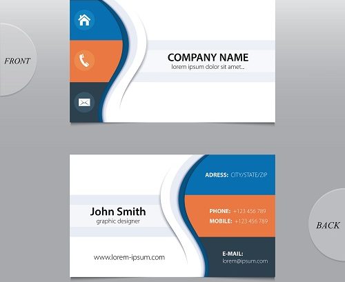
In today’s business world, first impressions are crucial. If you are a business owner, you understand the drill. It starts with a pleasant and respectful smile, brief but confident introduction followed by a firm handshake. To secure the introduction, business cards are generally traded, briefly checked out then tucked away. But did you know that your business card could work as an expansion of the first impression? This is why it is so crucial to have a card that is an exact and appealing depiction of yourself or your service. Unlimited Printing & Signs says there are a couple interesting factors that they, as a business printer should take into account while helping you make your calling card.

Below are some errors when creating business cards North Myrtle Beach:

  1. Leave the back space blank

If you engage with a client service or sales in your work, you may want to think about leaving the back space of your calling card blank. This provides you and also the customer or client the chance to take notes precisely your contact details throughout your meeting.

  1. Stay clear of varnish

With this said, it is very important to avoid placing any kind of glossy finish on your card. Although the shiny appearance is aesthetically attractive, it is troublesome as well as could be not practical because it is actually tough to write on.

  1. Consistency is key

An additional common error you need to prevent is disparity or inconsistency. Your business card must have the exact look and feel as your website. Obviously, you could be innovative! However, in general, the appearance should be natural and remain consistent with the overall look of your brand name, logo, and print advertising. Unlimited Printing & Signs can help you strike a wonderful equilibrium in between developing an original idea that fits with the remainder of the brand name you desire. In the business world, first impression is everything. This is why Unlimited Printing & Signs will help you establish the business card you desire to strengthen a great first impression and also lead you to worthwhile business possibilities!

Call Unlimited Printing & Signs for all your business card needs.

Unlimited Printing & Signs
2408 Madison Drive Suite 101
North Myrtle Beach, SC  29582
843-273-5290
https://www.upsprinting.com

Business Card Myrtle Beach

How To Make Business Cards Stand Out From The Crowd

Professional Business Cards

As wired-in as the majority of us are, chances are you still return from a networking event or a business meeting with a stack of business cards in your pocket. In a world where LinkedIn has replaced the Rolodex, and we routinely pack much more powerful tools of connectivity, why does the paper card still exist?

Think of business cards as more than scraps of paper. When we meet people at a Chamber event, business meeting or at a trade show or conference, it’s important we make an excellent impression, that we communicate who we are, what we do and why that information may be relevant to the person we just met. Your business needs to stand out, and absolutely nothing has yet matched the power and simplicity of handing out a well-designed card– it starts the discussion.

Business cards have a distinct potential for individual connections that can generate leads. Here are ways to optimize the area on that tiny paper canvas.

Business Card Tips

  1. Include appropriate social media links. Since many businesses see social media as a method to tell their story and engage with consumers, it makes good sense to highlight your Facebook page, LinkedIn account, Twitter handle, YouTube channel or Pinterest account on your card. Provide curious new friends a chance to see exactly what you’re about by directing them to social media outlets on which you’re active– however, limit the list to just those that are genuinely appropriate to your business. Which leads me to my next point.
  2. Lose the kitchen-sink technique. While you may be lured to offer a broad range of contact options (workplace contact, mobile phone, street address, email, Facebook business page, twitter ID and LinkedIn URL), a better approach is to cut all unnecessary contact information. Ask yourself: Where do you really engage with prospects? Where might they be more than likely to get a sense of you and your company? Keep in mind, the greatest real-estate hog is a complete street address when generally a city and state will be adequate. People will see much of this contact information when they visit your website or social media sites.
  3. Skip your homepage. This may appear counter-intuitive, but hear me out. It might be that your homepage is not the best place to start a discussion. Your company might be much better served by directing new potential customers and tire-kickers to a company blog site, an active resource page services pages or a landing page with a totally free download or video that’s informative and/or amusing. Numerous homepages are a fire-hose blast of information, however, a blog site or page of devoted material might provide a more workable taste of something pleasing.
  4. Be visual. An easy logo design is a yawner. Attempt using images or graphics that spark conversation and connection. Order more than one card with different images. Display your products, your team or if you are in a personal touch industry such as real estate or insurance – your photo.
  5. Inspire curiosity. One of my favorite cards was that of Michael Simon, CEO of LogMeIn: “Get in touch with me at [e-mail address] or [contact number] to talk business, or if you searching for a suggestion for a fantastic restaurant the next time you are in Budapest.” Concise? Sure. Curiosity-arousing? Absolutely.
  6. Link your online and offline worlds. A card can be a bridge between your online and in-person existence. Consider including a QR code that digitally passes on contact info or directs people to a web page. (However, make certain you’re delivering an optimal experience for the person who scans your code; too many have a bad experience these codes.).
  7. Think about your card as a call to action. Think about producing fine print runs of tailored cards customized to certain events, campaigns or markets. Possibly for a tradeshow, carry cards sharing a special download or show-specific offer. At a cocktail occasion, give out cards that invite partygoers to check out pictures of the gathering on Facebook.
  8. Make your card useful. I’ve seen cards created as mini-catalogs and sales brochures. Just recently, Robert Nolan of Gold Coast Advertisings in Hollywood, Fla., handed me his card– a tiny spiral-bound notebook. Now that’s more than pretty to take a look at. It’s downright helpful.

At UPS Printing, Marketing & Design we not only print your business cards, but we also help you design your cards. Call us today to stop by for a consultation.

Unlimited Printing & Signs
2408 Madison Drive Suite 101
North Myrtle Beach, SC  29582
843-273-5290
www.upsprinting.com/